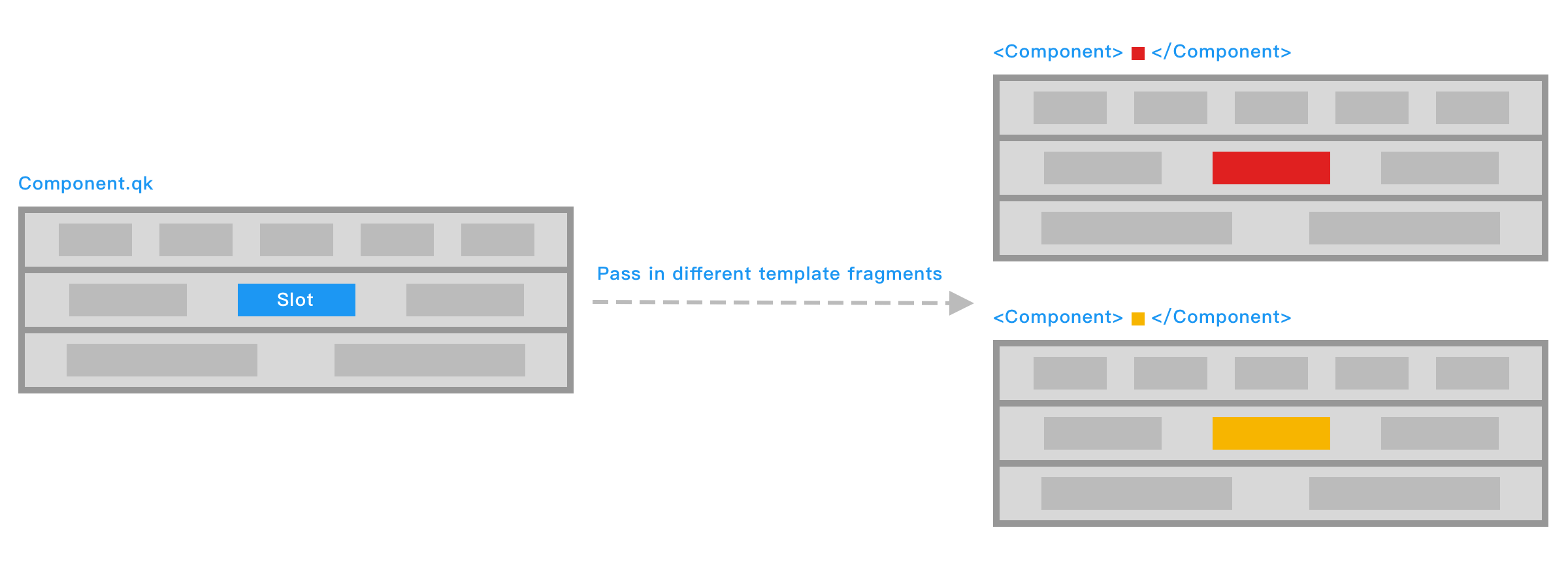
Slots
Component slots are used to pass structured UI content, that is, template fragments, into a component. Their biggest difference from attributes lies in the kind of content being passed: attributes pass data, while slots pass interface structure. Through slots, a parent component can insert custom DOM content into specific locations of a child component, enabling greater flexibility and reusability. This makes slots essential when building generic components such as layout containers, modals, and list renderers.
Basic Usage
Inside a component, use the slot tag to declare where slot content should be inserted. This location is called a slot outlet:
<!-- Inner.qk -->
<div class="inner-box">
    <slot></slot>
</div>
When using the component, you can provide a child element to fill this slot. That child element is called slot content:
<!-- Outer.qk -->
<Inner>...</Inner>
The rendered result of Outer is then:
<div class="inner-box">...</div>Slot content is not limited to plain text. It can be any valid template content, including elements and components:
<Inner>
    <FontIcon name="tip" />
    <p #for={3}>...</p>
</Inner>
Scope
Slot content can access data from the component where it is written:
<!-- The Inner component is the same as above -->
<lang-js>
    const langs = ["js", "ts", "qk"]
</lang-js>

<Inner>
    <p #for={item, index of langs}>
        {index + 1}/{langs.length}: {item}
    </p>
</Inner>
The rendered result of Outer is then:
<div class="inner-box">
    <p>1/3: js</p>
    <p>2/3: ts</p>
    <p>3/3: qk</p>
</div>
Default Content
Child elements inside the slot tag are treated as the slot's default content. If no slot content is passed from outside, the default content is rendered. This is somewhat similar to default parameter values in JavaScript functions:
<!-- Outer.qk -->
<Inner />

<!-- Inner.qk -->
<div class="inner-box">
    <slot>Default content</slot>
</div>
The rendered result of Outer is then:
<div class="inner-box">Default content</div>Named Slots
Many components need more than one slot. When a component has multiple slots, use the name attribute to distinguish them:
<!-- Article.qk -->
<article>
    <slot></slot>
</article>
<footer>
    <slot name="footer"></slot>
</footer>name attribute is named default by default.
When using the component, you can specify the slot name through the slot directive:
<Article>
    <!-- The slot name can be omitted when it is default -->
    <div #slot={"default"}>Article contents...</div>
    <p #slot={"footer"}>Copyright information...</p>
</Article>
When slot content consists only of text, or when you want to avoid adding meaningless extra wrapper tags, you can use the qk:spread built-in element as a virtual parent element:
<Article>
    <qk:spread>Article contents...</qk:spread>
    <qk:spread #slot={"footer"}>
        <p>Release information...</p>
        <p>Copyright information...</p>
    </qk:spread>
</Article>
Passing Context
As described in Scope, slot content can normally access only the data in the scope where it is written. In real development, however, you often need access to data from inside the child component. To do that, add attributes to the slot tag and pass them as context to the slot content:
<!-- Article.qk -->
<article>
    <slot
        !time={article.time}
        !title={article.title}
    ></slot>
</article>name attribute on a slot tag is used only to identify the slot itself. It is not passed into slot content.
At the slot outlet, you can receive this context object through the slot directive and assign it to an identifier:
<Article>
    <qk:spread #slot={articleInfo from "default"}>
        <h1>{articleInfo.title}</h1>
        <p>Published in {articleInfo.time}</p>
    </qk:spread>
</Article>
You can also destructure the context object directly when receiving it through the slot directive:
<Article>
    <qk:spread #slot={{ title, time } from "default"}>
        <h1>{title}</h1>
        <p>Published in {time}</p>
    </qk:spread>
</Article>Render by Slot Presence
In some cases, a component needs to decide whether to render a part of its structure based on whether a specific slot has been passed. For this, you can use the slots compiler intrinsic. slots is an object, and accessing a property on it by slot name returns a boolean: if that slot was passed, the result is true; otherwise it is false.
In the following example, the footer area is rendered only when footer slot content is actually passed from outside:
<section class="panel">
    <div class="panel-content">
        <slot></slot>
    </div>

    <footer
        class="panel-footer"
        #if={slots.footer}
    >
        <slot name="footer"></slot>
    </footer>
</section>